Designing a High-Conversion Onboarding Experience
Transforming a passive, form-driven onboarding into a guided, conversational experience that drives engagement, cross-sells courses, and reduces refunds.
Click through the flow yourself
The full Figma prototype of the new-user flow. Click, type and tap as a family would.
Signing up felt like paperwork
New families filled in one long form, then landed on the dashboard with no welcome, no guidance and no idea what else BrightCHAMPS offered.
A long data form, used by kids aged 8–15. Nothing about it felt like theirs.
After submitting, families were dropped on the dashboard cold.
Only 10% of families went on to a second course — the flow never showed them the rest.
A child and a parent, signing up together
They sit at the same laptop but want different things from the same five minutes.
- Feel like he's starting a game
- See himself in it — a photo, an ID card
- Get to the first class fast
“I want it to feel like a game I'm starting — not paperwork my mom is doing.”
- Set everything up right the first time
- Clear steps, in order
- Confidence the money is well spent
“Just tell me what to do, in order, and show me it's working.”
Turn the form into a conversation
Same information, collected differently: a friendly guide, Prof. Greenline, walks the family through short scenes instead of one long page.
- One long form
- No one guiding you
- Ends on an empty dashboard
- 14 short scenes
- Prof. Greenline leads the way
- Ends with a free class and an ID card
A few fields per screen, never a wall of inputs.
“Tell us about Sara's school” — the child is the subject.
Tiles, chips and toggles wherever an answer is a choice.
A free class and an ID card give a reason to finish.
The flow, screen by screen
Twelve key screens from the 14-scene flow, each with the reason behind it. Pick a screen, or use the arrows.
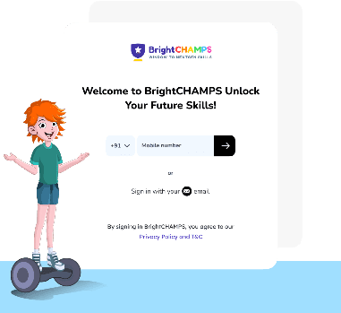
Welcome
Prof. Greenline greets the family. A guide, not a form.
What worked, and what I'd change
Course suggestions, sibling accounts and scheduling were decided before any screen was drawn, so the interface never had to cover for an undecided system.
The dialogue was shaped by adults. I'd put it in front of 8–12 year-olds earlier — they read and click very differently.
A first impression is a product decision.
The old flow collected data and dropped families on a dashboard. The new one treats the first five minutes as the start of the relationship — a guide, a name on every screen, a course worth trying and a free class at the end.
“Fourteen scenes. Two paths. One conversation.”