A child opens the dashboard minutes before a live class. The old page offered banners, three class cards and a feed, and nothing said which one mattered now.
In short
- Problem
Course completion was 35%, and children couldn't tell which Join button was for today's class.
- What I did
I used click heatmaps to rebuild the page around one question: what's next?
- Result
Course completion rose to 58%, measured a year after launch.
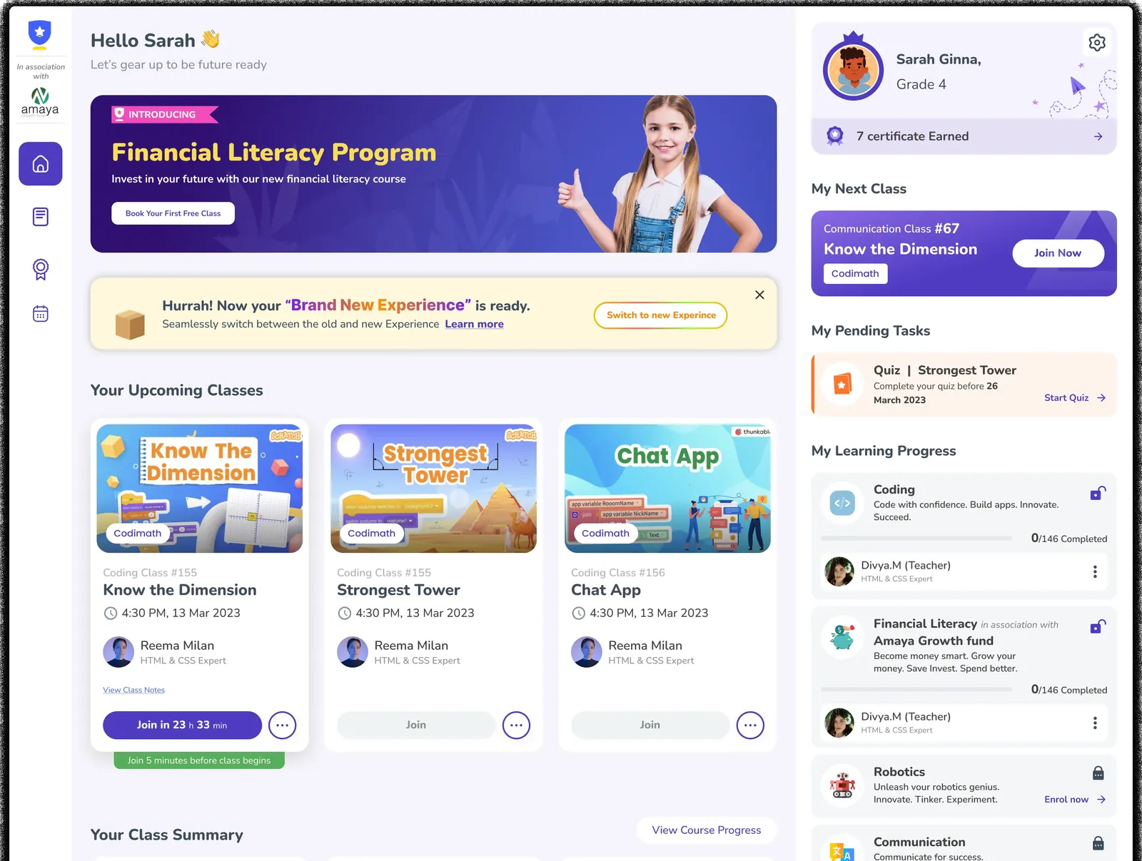 Banner · new courseBanner · new experienceMy Next Class · Join NowClass card · Join in 23h?Which one is now?
The old home page, as children saw it.
One afternoon
4:20 PM. Troy has Coding Class #16 at 4:30.
He opens his dashboard. A banner, another banner, then three class cards that look almost the same.
He taps Learning progress to see how far he's got. Nothing opens.
Next week his teacher cancels. The notice arrives looking like every other notification.
Nothing on the page tells him what matters right now, or what to do next.
An illustrated afternoon. Troy is the demo student shown in the designs. The situation is imagined, based on support requests, feedback and user surveys with students, teachers and parents.
The problem
Everything on the page wanted his attention.
Each part was useful on its own. Together they buried the one thing he came for. Hover the numbers.
- 1A promo bannerThe biggest space on the page sells a course.
- 2A second bannerAnother one, about switching to the new experience.
- 3Three class cardsThree classes in a row, each with its own Join button, styled almost alike.
- 4My Next Class, againThe next class shows up a second time on the right, in a different style.
- 5Learning progressBars and locks that didn't open anything. The heatmaps showed dead clicks here.
What goes wrong
Four small failures before one live class.
- 01No shared languageEvery section behaved like its own product. He relearned the interface on every screen.
- 02Everything competesDense screens hid the essentials. Too much asked for attention at once.
- 03Errors look routineA cancelled class or a failed payment blended into the feed like any other notification.
- 04No sense of priorityThe page never told a child what mattered today, or what to do next.
What the clicks said
We watched where children actually clicked. This is what turned up.
Click heatmaps of the old home page, mid-2024. Student and teacher names are blurred.
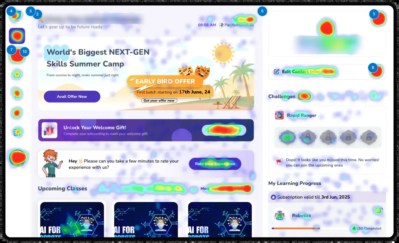
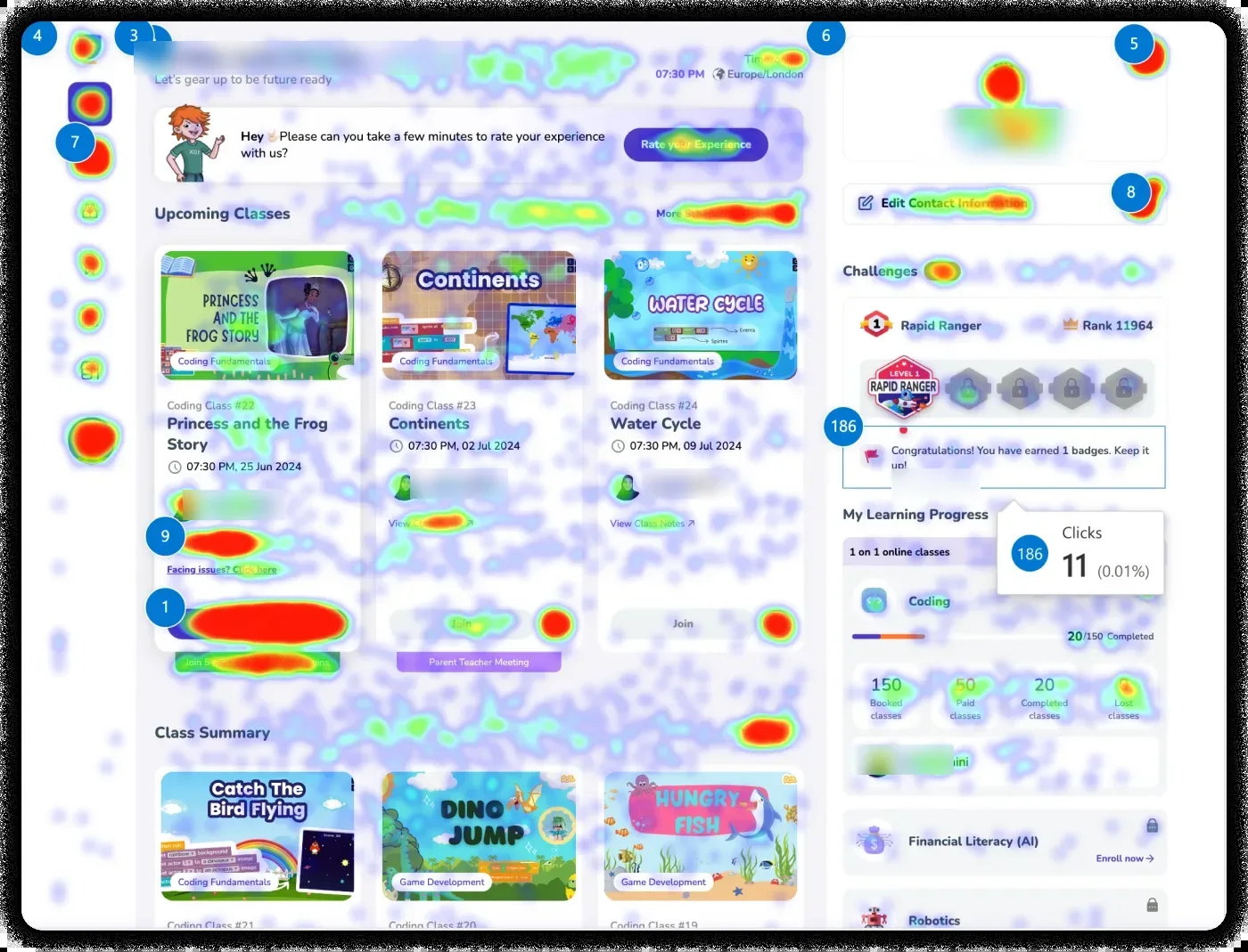
Class summary carried the most weight. So the next class moved to the top of the page.
Reward unlocks pulled clicks. So rewards got a permanent place in the rail.
Progress drew dead clicks. So every subject now opens its lessons, quizzes and assignments.
Read the three together and they say the same thing: show what's next, then let him act on it.
Honest notes: Troy and his afternoon are an illustration. The heatmaps, the screens and the numbers on this page are real, from the shipped dashboard.
The page, then and now
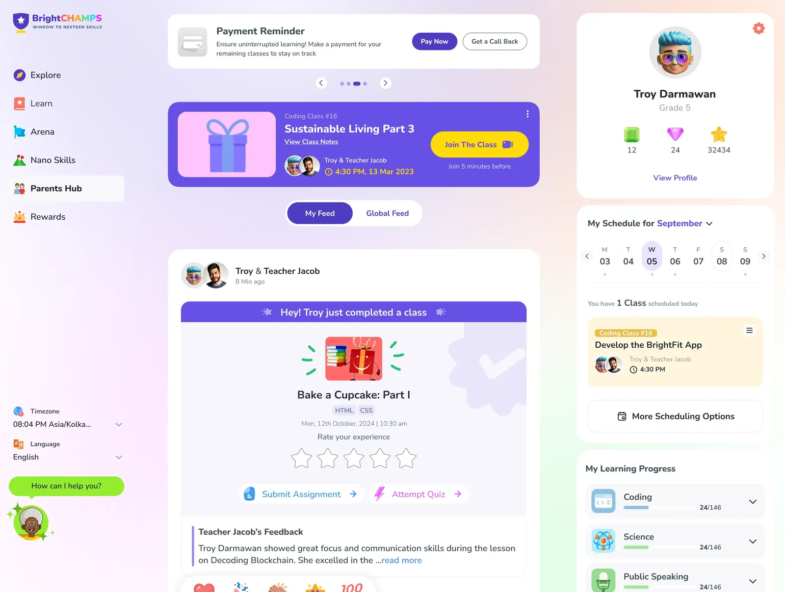
The same afternoon, before and after.
Drag to compare the old home page with the new My Feed.
The insight
He doesn't need more cards. He needs to know what's next.
A card is a label. What helps is what sits behind it. Pick a state.
Coding Class #16, Develop the BrightFit App, starts at 4:30 with Teacher Jacob.
Join opens five minutes before. Until then, nothing.
The yellow button counts down, then lets him in.
BrightBuddy sits bottom left, one tap away.
Wording follows the designed screens. Class names are demo data from the designs.
The flow
See what's next. Then join, fix it, or look back.
Pick a path to trace it. It plays on its own until you do.
The easy case. He joins, and the class turns into a post.
The screens
Seven screens, in the order he meets them.
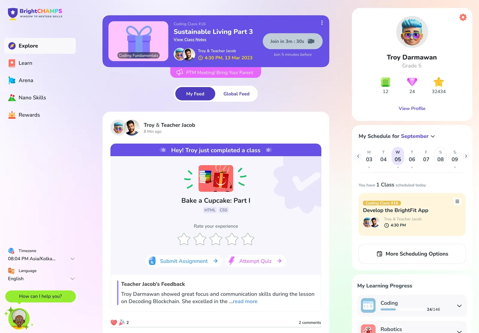
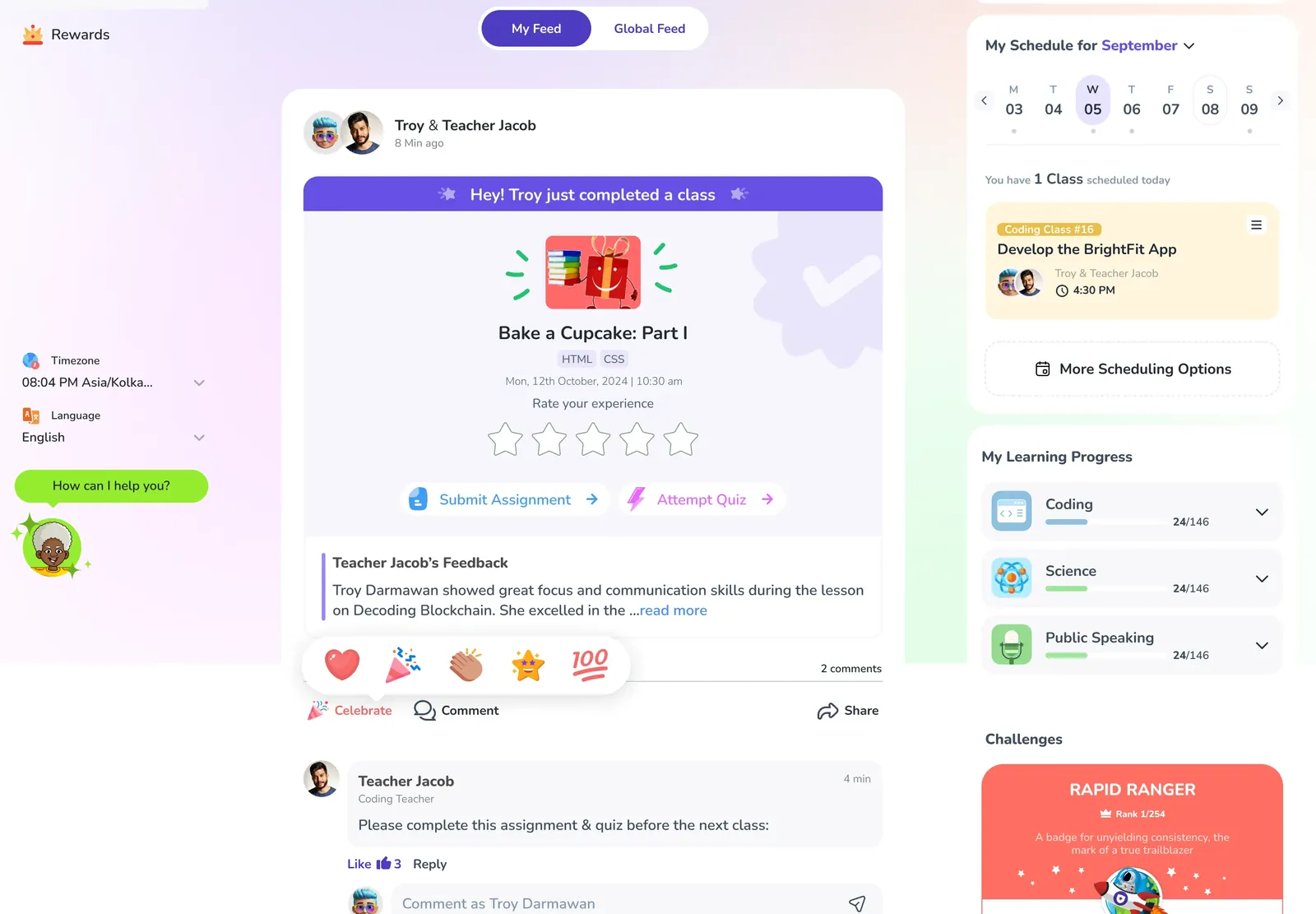
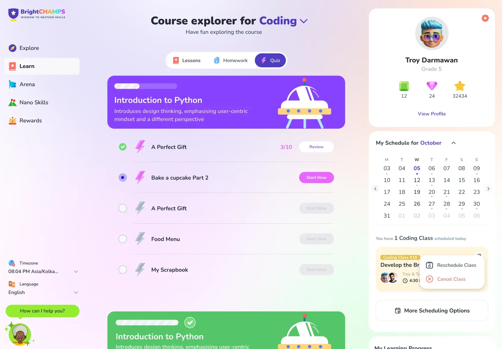
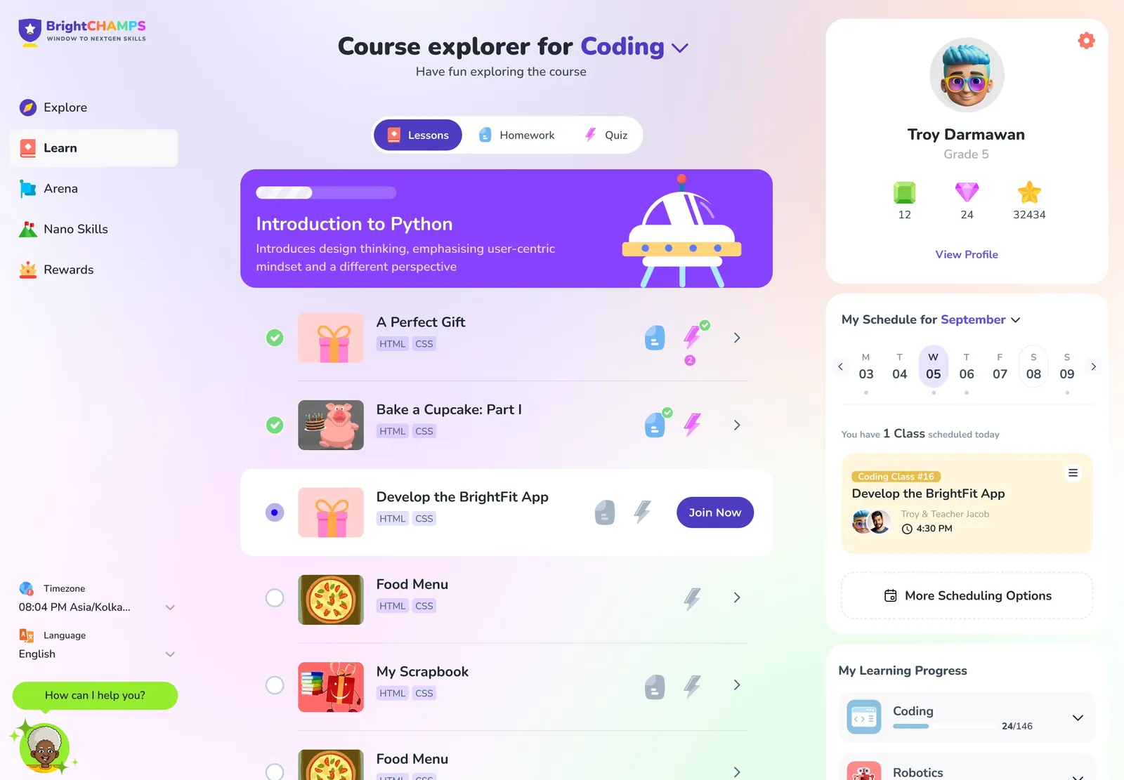
Next class first
The top of the page is one card: the class, the teacher, the time and a single yellow Join button that counts down. Nothing sits above it.
The catch. One card on top pushes everything else down. Rewards and progress had to move into the rail to stay in view.
The class becomes a post
When the class ends it turns into a post in My Feed: rate it, submit the assignment, attempt the quiz, read the teacher's feedback. One place for everything the class left behind.
The catch. A feed can grow into noise. My Feed keeps it to his own classes; Global Feed is where everyone else's live.
A rail that stays put
Profile, this week's schedule and learning progress sit in the same place on every tab. Progress now opens, so the dead clicks from the heatmaps turn into answers.
The catch. Anything tappable has to lead somewhere useful every time, or it's just a nicer dead click.
Learn, as a path
The course explorer lays modules out as a path: done, now and next. Lessons, homework and quizzes share one list and one set of states, with Join Now on the live one.
The catch. A path only helps if its states are true. Done, now and next have to match what the teacher marked.
When the teacher cancels
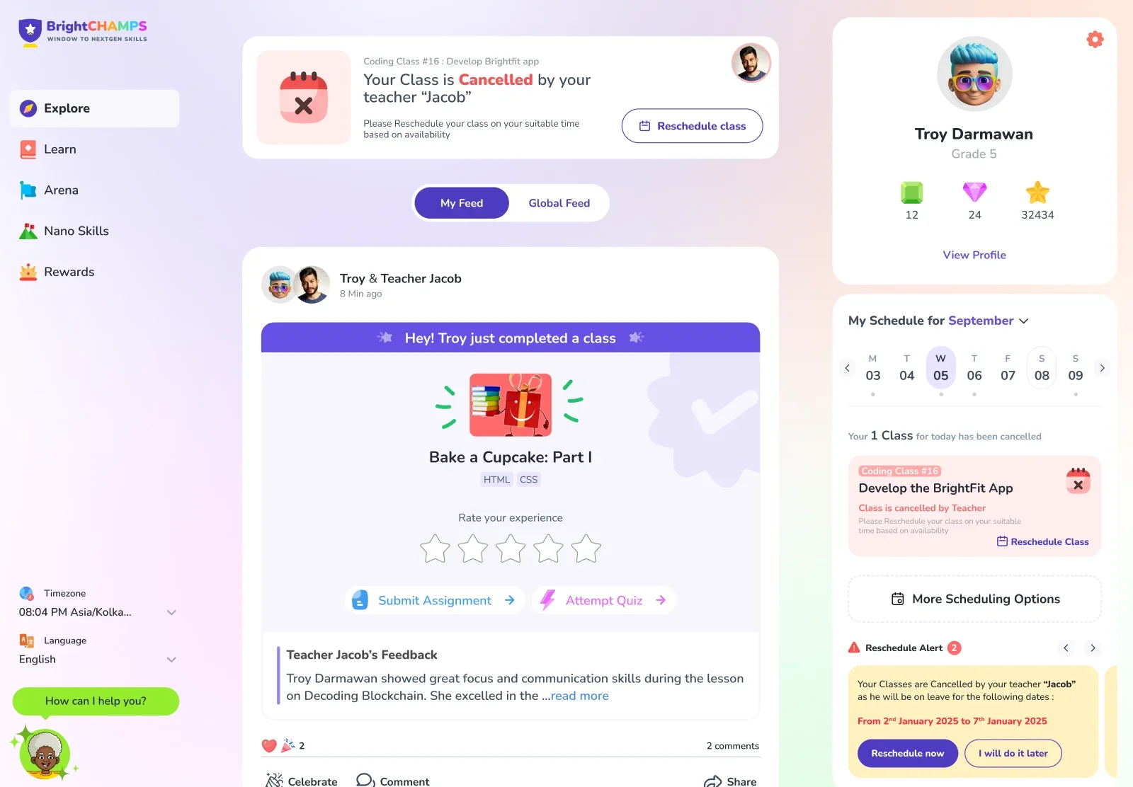
This time the news takes the top spot in its own card, says what happened in plain words and offers one next step: Reschedule class.
The catch. Alerts lose their weight if everything becomes one. This style is kept for things that change his day: a cancellation, a failed payment, a timezone mismatch.
Rescheduling, in a chat
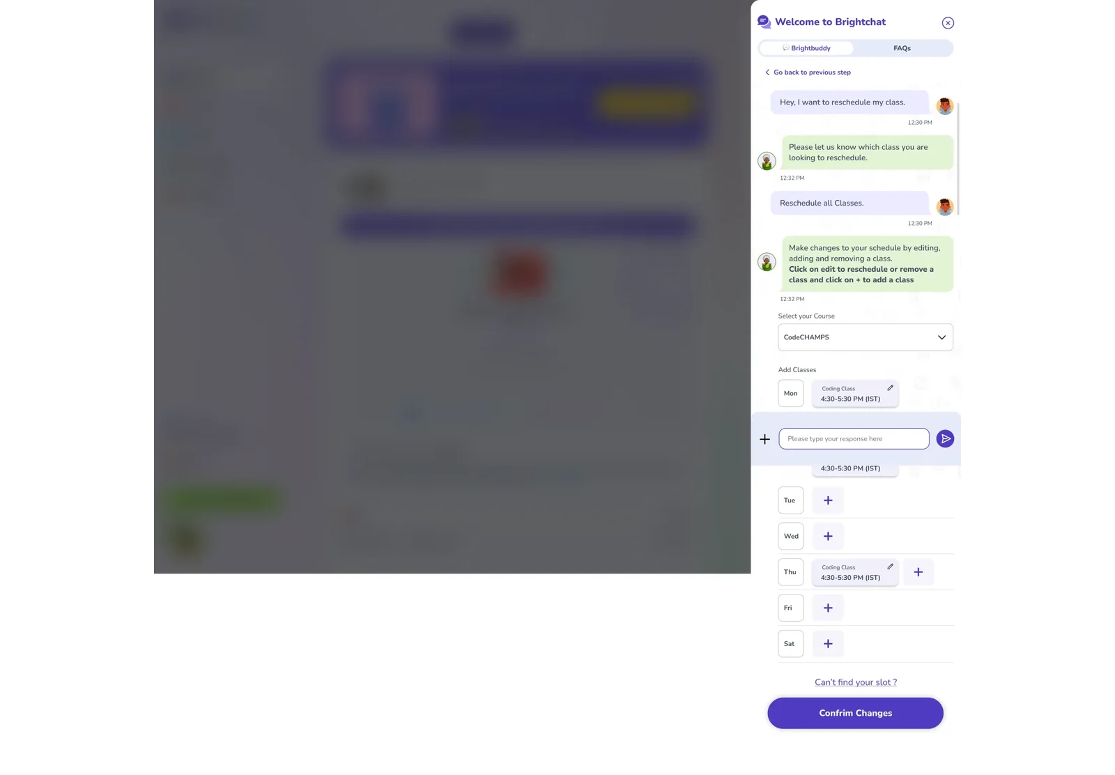
BrightBuddy reads his classes and walks him through it: which class, which day, which open slot. Confirm, and the schedule updates. Designed with the team.
The catch. A chat is slower for someone who knows what he wants, so the schedule card keeps a direct Reschedule too.
Back on track
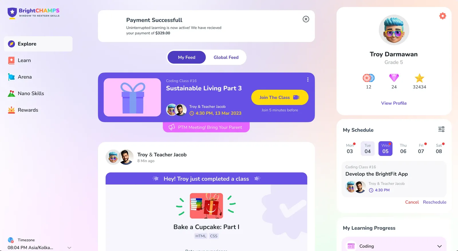
If a payment doesn't go through, classes pause and the page says so. Once it's paid, the same spot confirms it and the next class is back on top.
The catch. Payment talk on a child's screen has to stay short: what's paused, and the way back.
End of the walkthroughScreens are the shipped designs. Troy's reactions are illustration, not test results.
Your turn
Now try Troy's afternoon yourself.
A working rebuild of the dashboard. Pick a situation, then join the class, reschedule with BrightBuddy, enroll in a course or redeem gems.
What changed
This one shipped. A year later, we measured it.
April–June 2025 against the same months of 2024.
A clear next step. The next class is the first thing on the page.
Fewer dead ends. Progress, cancellations and payments each lead somewhere.
Class life in one place. Rating, assignment, quiz and feedback live in one post.
Help that knows him. BrightBuddy starts from his own classes.
April–June 2024: 51,980 students. April–June 2025: 93,786 students. Visits are per student over three months.